By Glenn Gallop, President, forProject Technology, Inc.
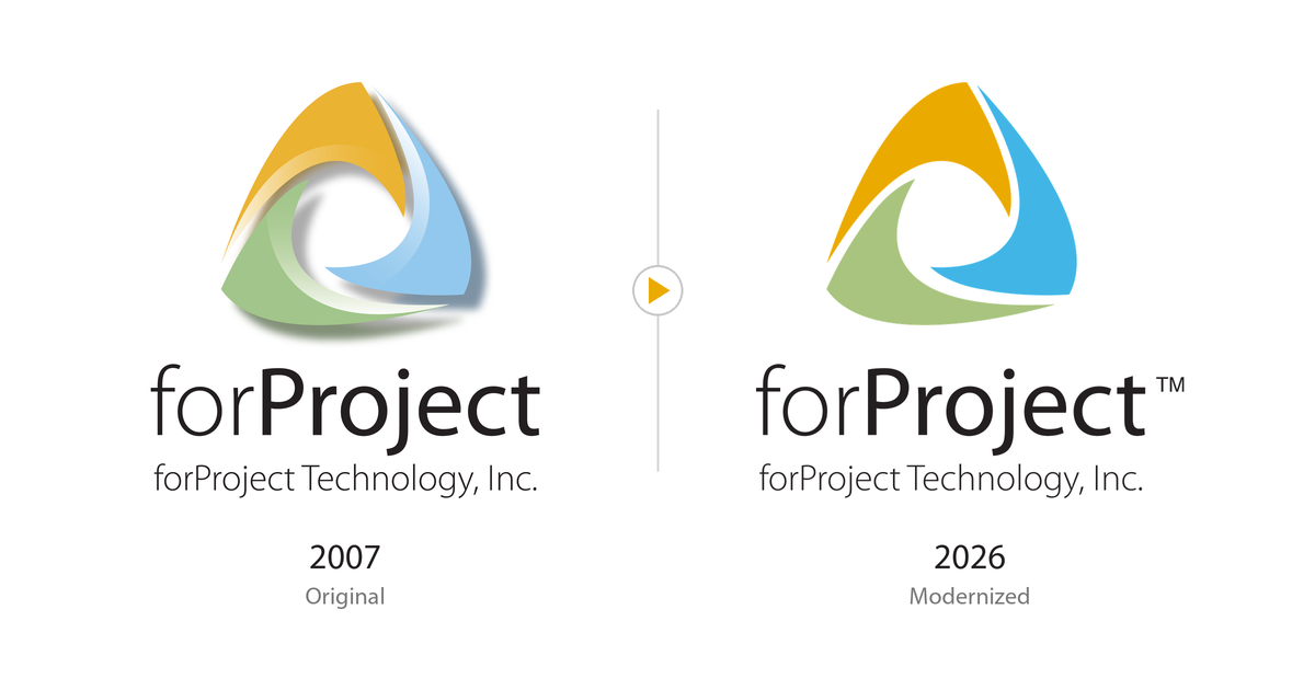
TL;DR: After 19 years, forProject has modernized its logo. The shape is the same, the colors are cleaner, and there are no more gradients or shadows. The three swirls still stand for what EVM is all about: bringing scope, cost and schedule together.
Read the full story: About forProject: Our Logo
Our logo has always stood for the three things earned value management brings together: scope, cost and schedule.
When forProject launched in 2007, we worked closely with an outside design firm to create a logo that said something about the work our customers do.
The three swirls stand for scope, cost and schedule. They wrap around each other and meet at the center.
That is earned value management in one picture: you only get a true measure of project performance when all three are managed together.
Nineteen years later, that idea hasn’t changed. The design styles of 2007 have.
Gradients, bevels and drop shadows looked sharp back then. Today they look dated, and they don’t reproduce cleanly on screens, in print, or at small sizes.
So we’ve updated the logo without redesigning it:
- Same shape. The swirls and the forProject lettering are unchanged.
- Flat, solid colors. Gold, blue and green, now matched to standard Pantone colors so they print consistently.
You’ll see the new look first here on forproject.com. Over time it will roll into our training materials, documents and the software itself.
Does anything change for customers?
No. Your software, support and licensing all stay exactly the same. Only the look is new.